Vintage Botanical Prints for Cottagecore Rooms (2026)
Cottagecore rooms live or die by the wall art, and vintage botanical prints are the fastest way to nail the pressed-flower, cottage-garden mood without repainting a single wall in 2026.
- Between The Lilies is the safe pick for cottagecore bedrooms in 2026 - Buy.
- Spike Bouquet is the wildcard for anyone wanting a looser, wildflower-market look - Consider.
- Skip glossy black frames on vintage botanical prints; they read modern, not cottage-attic.
- A 3-piece gallery cluster under 24 inches wide reads more authentic than one oversized print.
- Vesna Echinacea suits purists who want pressed-flower accuracy over decorative interpretation - Buy.
Why this matters
Cottagecore isn't a fad that fades after one Pinterest board cycle - it's held steady as one of the most-searched interior styles year over year, and vintage botanical prints are the anchor piece of the look. A curated vintage botanical prints collection does more heavy lifting in a cottagecore room than any throw pillow or dried-flower vase ever will.
The mistake most shoppers make in 2026 is buying "botanical-adjacent" art - bright, saturated modern florals - and calling it cottagecore. It isn't. Vintage botanical prints need a specific color temperature, a specific illustration style, and a specific relationship to scale that generic floral wall art doesn't have.
Who this is for
This guide is for the interior lover building a cottage-garden bedroom, reading nook, or dining nook - someone who wants a room that looks inherited rather than shopped. It's also for renters who want the aesthetic without commitment, and for gift buyers picking something for a friend who keeps a windowsill full of herbs and always smells like lavender.
If your room leans more Japandi or Coastal Luxe, most of this won't apply - vintage botanical prints clash with the clean-line minimalism those styles rely on.
What to look for in vintage botanical prints for cottagecore rooms
Botanical accuracy over generic florals
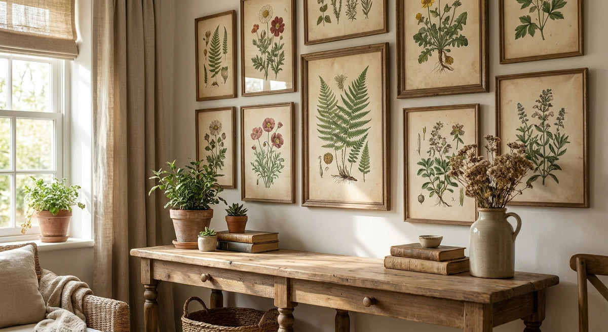
A true botanical print is illustrated like a field guide - stems, roots, and leaf structure rendered with the same care as the bloom. Generic "floral wall art" skips the structure and just paints a pretty flower shape, which reads decorative rather than vintage. Cottagecore rewards the detail; that's what makes it feel collected rather than mass-produced.
A warm, aged color palette
Look for sepia undertones, dusty rose, sage green, and faded mustard - not the crisp white backgrounds and saturated color you see in modern floral prints. A true vintage palette looks like it's been sitting in a sunlit window since the 1970s, and that aging is the entire point in a cottagecore space.
Scale built for gallery walls
Cottagecore rooms rarely lean on one giant statement piece. They build texture through clusters - three or four smaller prints of 12x16 or 16x20 inches grouped together tell a better story than one 40-inch canvas. Buy vintage botanical prints with clustering in mind, not solo impact.
Framing that reads "found," not "bought"
Natural wood, brushed brass, or thin black hairline frames work. Glossy black or heavy modern frames undo everything the print is doing - they signal contemporary, not vintage. If a frame option looks like it belongs in a downtown loft, skip it for this room.
Set flexibility
Some of the best vintage botanical prints come as sets of two or three, which makes building a gallery wall faster and keeps the color story consistent without you having to hunt for matches across different product lines.


Top picks for cottagecore rooms in 2026
Between The Lilies - the safe pick. This is the print that fits nearly every cottagecore layout without a second thought: soft botanical linework, a muted palette, and a composition that anchors a gallery wall instead of fighting it. It reads romantic without tipping into twee, which is the hardest balance in this whole category. Verdict: Buy. See it here: Between The Lilies print.
Spike Bouquet - the wildcard. Looser brushwork and a more overgrown, just-picked-from-the-garden feel make this the pick for a reading nook or a bathroom that wants personality over polish. It's a stronger statement piece, so it works best as a single hang rather than part of a cluster. Verdict: Consider. Browse it here: Spike Bouquet canvas.
Vesna Echinacea - the pressed-flower purist's pick. If you want the actual field-guide look - accurate stem structure, muted botanical illustration, minimal decorative flourish - this is the closest thing to a real 19th-century herbarium page you'll hang on drywall. Verdict: Buy for anyone who wants authenticity over interpretation.
Under The Fig Tree - the layered garden scene. This one leans into a fuller, more narrative composition rather than a single stem study, which makes it a strong centerpiece over a dining table or reading chair. It's busier than the others on this list, so it needs breathing room around it. Verdict: Consider for larger walls; Skip it for a tight gallery cluster where it'll compete with smaller prints.
What to avoid
- Oversaturated "vintage-style" florals. A lot of mass-market prints slap a sepia filter on a modern floral photo and call it vintage. Real vintage botanical illustration has linework and shading you can see up close - a filtered photo won't hold up at that distance.
- Black gloss frames. They photograph well on Instagram but they kill the cottage-attic feel the moment you stand in the actual room.
- Confusing cottagecore with farmhouse. The two get lumped together constantly, but farmhouse leans on neutrals, shiplap textures, and utilitarian objects rather than botanical romance. If that's actually the look you're after, the farmhouse wall art guide is the better starting point than this one.
Verdict comparison
| Best for | Palette | Verdict | |
|---|---|---|---|
| Between The Lilies | Gallery wall anchor | Muted, romantic | Buy |
| Spike Bouquet | Statement single hang | Loose, garden-fresh | Consider |
| Vesna Echinacea | Field-guide purists | Sepia, botanical | Buy |
| Under The Fig Tree | Larger walls, narrative scenes | Layered, warm | Consider / Skip for tight clusters |
FAQ
What are vintage botanical prints?
Vintage botanical prints are illustrated reproductions of historical plant studies, showing stems, leaves, and blooms with field-guide accuracy in a muted, aged color palette. They're the anchor art style for cottagecore rooms in 2026 because they read as collected rather than decorative.
Are vintage botanical prints good for cottagecore rooms?
Yes, vintage botanical prints are one of the strongest wall art choices for cottagecore rooms because their muted palette and illustrative detail match the collected, lived-in look the style is built on. Bright, saturated florals do not achieve the same effect.
How many vintage botanical prints should I hang together?
Three to four smaller prints in the 12x16 to 16x20 inch range typically read better than one oversized canvas in a cottagecore room. Clustering builds the collected-over-time feel that defines the style.
What frame works best with vintage botanical prints?
Natural wood or brushed brass frames work best, along with thin black hairline frames. Glossy black or heavy modern frames tend to undercut the vintage effect the print is going for.
Is vintage botanical the same as farmhouse wall art?
No, they overlap but aren't the same. Vintage botanical leans on illustrated florals and a romantic palette, while farmhouse style leans on neutrals and utilitarian textures.
Where should vintage botanical prints be hung in a cottagecore room?
Bedrooms, reading nooks, and dining areas are the strongest fits, especially as a gallery cluster above a bed frame or a small seating area. Bathrooms work well too if humidity-safe framing is used.
Do vintage botanical prints work as gifts?
Yes, a single framed vintage botanical print or a set of two makes a strong housewarming or birthday gift for anyone building a cottagecore or garden-inspired room in 2026.
One last thing
The detail most people miss: vintage botanical prints look their best under warm-toned lighting, not daylight bulbs. A 2700K bulb over a gallery cluster will pull out the sepia and dusty rose tones that make these prints feel aged; a cool white bulb flattens them into looking printed rather than found.