Watercolor Wall Art for Soft Interiors: 2026 Buying Guide
Watercolor wall art brings blurred edges and diffused color into a room without shouting for attention, which is why it dominates Japandi, Coastal Luxe, and cottagecore mood boards heading into 2026. If your palette leans soft — muted blush, sage, linen white — the wrong print reads harsh even when the room is calm. This guide breaks down what actually works.
- Between The Lilies is the safest watercolor wall art pick for muted bedrooms and nurseries in 2026 — buy it.
- Soft Blush Serenade brings blush-pink watercolor tones that pair with Coastal Luxe and cottagecore palettes — buy it.
- Skip high-saturation watercolor prints in rooms under 120 square feet; they read busy, not soft.
- Vesna Echinacea anchors a Japandi wall at 30x40 inches above a bed or sofa — consider it.
- Gioia Wall Art's Tender And Soft watercolour set lets you build a gallery wall without matching frames.
Why this matters
Soft interiors depend on restraint — matte finishes, low-contrast palettes, natural light that doesn't bounce hard off glossy surfaces. Watercolor wall art fits that brief because pigment naturally fades to white paper or raw canvas at the edges instead of stopping at a hard line. A photo print or a saturated graphic poster does the opposite: it holds a crisp edge and a flat, even tone, which can make a Japandi or coastal room feel busier than intended.
The trade-off is that not every piece labeled "watercolor" actually behaves like watercolor once it's printed at scale. Some designs get reproduced with heavier ink saturation that kills the bleed effect entirely. Knowing what to check before you buy saves you from a print that looks soft on a screen and flat on the wall.
Who this is for
This guide is for anyone decorating a room built around a muted, low-contrast palette — nurseries, primary bedrooms, reading nooks, or any Japandi, Coastal Luxe, or cottagecore-leaning space where the goal is calm, not a focal-point statement piece. If you're browsing Gioia Wall Art's curated collection for something that adds texture without adding visual noise, watercolor is the category to shop first. It's also the right call for interior designers staging soft-palette client rooms where bold abstracts would fight the furniture.
If you actually want a loud accent wall, skip ahead — this isn't the guide for high-contrast graphic prints.
What to look for in watercolor wall art for soft interiors
Color bleed at the edges
Real watercolor character comes from pigment fading into white space rather than stopping at a hard boundary. Hold a product photo at full zoom and check the edges of the main subject — if every shape has a clean, even outline, the print will read more like a flat illustration than a soft wash once it's on canvas.
Undertone match to your wall color
Blush pinks, sage greens, and warm creams all carry either a warm or cool undertone, and mismatched undertones are the fastest way to make a soft room look muddy. Hold your paint swatch or a fabric sample next to the print's dominant tone before buying — a cool grey wall next to a warm terracotta watercolor will fight rather than blend.
Canvas vs. matte print finish
Canvas absorbs and softens light, which suits the diffused look of watercolor; a glossy poster finish reflects glare and can flatten the same artwork into something harder-edged. For soft interiors, matte or canvas beats gloss almost every time, especially in rooms with strong afternoon light.
Subject scale relative to the wall
Watercolor's soft edges disappear at small sizes — a 12x16 print of a delicate floral wash reads as a smudge from across the room. For a wall above a bed or sofa, 24x36 inches or larger keeps the wash visible and intentional rather than accidental. For more on matching size to furniture, see Gioia Wall Art's guide to abstract floral wall art for modern living rooms.
Framing that doesn't fight the softness
A heavy black frame reintroduces the hard edge you're trying to avoid. Natural wood, white, or no frame at all keeps the visual weight low and lets the wash do the work — this matters more in watercolor than in almost any other wall art category.
Room-specific durability
Bathrooms and kitchens add humidity and grease into the mix, so a canvas print without a protective coating can warp or discolor faster than in a dry bedroom. If you want watercolor in a moisture-heavy room, confirm the finish is rated for it before you commit.
Top picks for soft interiors in 2026
Between The Lilies — the safe pick. Muted lilac and sage floral washes with visible pigment bleed at every petal edge, sized well at 24x36 for a nursery or a calm bedroom wall. It reads soft from three feet or ten. Verdict: Buy. View Between The Lilies
Soft Blush Serenade — the blush pick. Warm pink and cream washes with almost no hard edges, built for a Coastal Luxe or cottagecore living room where you want warmth without pattern. Works best at 30x40 inches above a sofa. Verdict: Buy. View Soft Blush Serenade
Vesna Echinacea — the botanical anchor. Cool green and white florals with a raw-paper texture that pairs naturally with linen upholstery and unbleached wood in a Japandi room. It's a quieter piece than the first two picks, better as a single statement than part of a gallery grouping. Verdict: Consider. View Vesna Echinacea
Warm Protea Style A — the warm-toned wildcard. Terracotta and rust protea washes that add warmth to an all-neutral room without introducing pattern or hard color blocking. It's a stronger accent than the other picks here, so use it as one piece, not a pair. Verdict: Consider.
Champagne Peaches — the dining-room pick. Soft champagne and peach fruit-inspired washes that suit a breakfast nook or dining wall with a similarly muted palette. In a high-traffic, bold-colored kitchen it gets lost. Verdict: Buy for a soft dining space, Skip for a bold one.


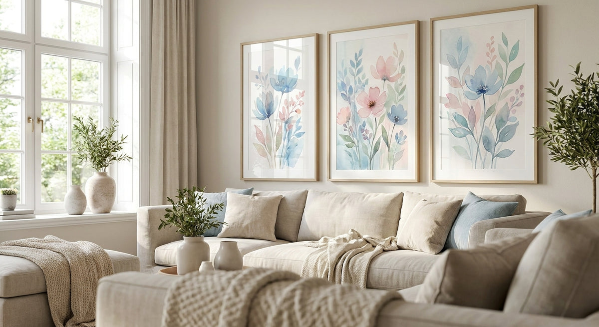
Three smaller watercolor pieces hung with breathing room between them often read softer than one large saturated canvas, because each panel keeps its own negative space instead of competing for it.
What to avoid
- Watercolor prints with heavy black ink outlines. They look illustrative rather than soft, and the hard line defeats the entire point of choosing watercolor over a graphic print.
- High-gloss canvas finishes. Glare from a glossy surface flattens the wash effect and fights the diffused light a soft interior depends on.
- Abstract watercolor pieces with more than three dominant colors in a small room. In a space under 120 square feet, extra color competes with soft furnishings instead of complementing them.
“If a watercolor print has a crisp black outline around every shape, it's not going to soften your room the way you think it will.”
Verdict comparison
| Pick | Palette | Best room | Suggested size | Verdict |
|---|---|---|---|---|
| Between The Lilies | Lilac, sage | Bedroom, nursery | 24x36 in | Buy |
| Soft Blush Serenade | Blush, cream | Living room | 30x40 in | Buy |
| Vesna Echinacea | Green, white | Japandi study | 24x36 in | Consider |
| Warm Protea Style A | Terracotta, rust | Neutral accent wall | 18x24 in | Consider |
| Champagne Peaches | Champagne, peach | Dining nook | 18x24 in | Buy (soft rooms only) |
FAQ
What's the best watercolor wall art for a soft interior?
Between The Lilies and Soft Blush Serenade both work well for soft, muted rooms in 2026 because the pigment bleeds naturally at the edges instead of holding a hard line. Both suit bedrooms, nurseries, and Coastal Luxe living rooms.
Is watercolor wall art better than a graphic print for a calm room?
Yes, for soft interiors watercolor beats a graphic print because the diffused edges match a low-contrast, matte palette. A crisp graphic print introduces hard lines that can make a muted room feel busier.
How much does watercolor wall art cost?
Single watercolor prints from Gioia Wall Art run in the $59 to $180 range depending on size and finish, with multi-panel sets priced higher. Check the current listing on each product page for exact pricing.
What size watercolor wall art should I buy for above a bed?
Aim for 24x36 inches or larger above a queen or king bed so the wash effect stays visible from across the room. Anything smaller than that tends to read as a smudge rather than an intentional piece.
Does watercolor wall art work in a bathroom?
It can, but confirm the print has a moisture-resistant finish before hanging it in a humid bathroom. Untreated canvas can warp or discolor faster in high-moisture rooms than in a dry bedroom.
Should watercolor wall art be framed or unframed?
Natural wood or white frames keep the soft look intact, while heavy black frames reintroduce the hard edge watercolor is meant to avoid. Unframed canvas also works well for a softer, more casual finish.
Can I mix watercolor wall art with photography in the same room?
Yes, as long as the photography leans muted and low-contrast rather than high-saturation. Pairing a soft watercolor floral with a black-and-white photo print usually works better than pairing it with a bold color photo.
What's the difference between watercolor and abstract wall art?
Watercolor wall art specifically mimics the pigment-bleed look of painted washes, while abstract wall art covers a much wider range of shapes, textures, and color-blocking styles. Watercolor is a subset of abstract, not a synonym for it.
One last thing
The piece that tends to work hardest in a soft interior isn't the biggest one on the wall — it's the one with the most negative space. A watercolor print that's 40% pigment and 60% untouched paper or canvas will read calmer in 2026's muted interiors than a fully saturated piece twice its size, and it costs less to boot.