Accent Wall Art: Best Picks and Sizing Rules for 2026
An accent wall only works when the art on it earns its spotlight — the wrong piece looks like an afterthought, the right one becomes the reason people walk into the room. Here's how to pick accent wall art that actually holds its own against paint, texture, or wallpaper.
- Secret Villa is the safe pick for warm, neutral accent walls in Coastal Luxe or Japandi rooms in 2026 — Buy.
- Vanishing Desert is the wildcard for a bold terracotta or clay-toned accent wall — Buy.
- Cover 60-75% of the wall's width with a single piece or a tight cluster; anything smaller reads as an afterthought.
- Skip prints under 16x20 inches on any wall wider than 8 feet — they disappear.
Why this matters
An accent wall carries visual weight the rest of the room doesn't — it's the wall you painted differently, tiled, or wallpapered specifically to draw the eye. Hang the wrong scale of art on it and you've fought your own design decision. The curated collection at Gioia Wall Art exists partly for this problem: rooms where one wall needs to do more work than the other three, and the art on it needs to match that job in 2026, not compete with the paint.
Most accent wall mistakes aren't about taste. They're about scale, contrast, and subject matter fighting the wall instead of finishing it.
Who this is for
This guide is for anyone who has already committed to an accent wall — paint, wallpaper, shiplap, or exposed brick — and now needs the art that sits on top of it to look intentional. That includes first-time decorators nervous about "getting it wrong," renters using peel-and-stick treatments who want commitment-free art, and interior lovers mid-renovation trying to nail down a Japandi, Coastal Luxe, or Cottagecore accent wall before the rest of the room follows its lead.
What to look for in accent wall art
Scale relative to the wall, not the room
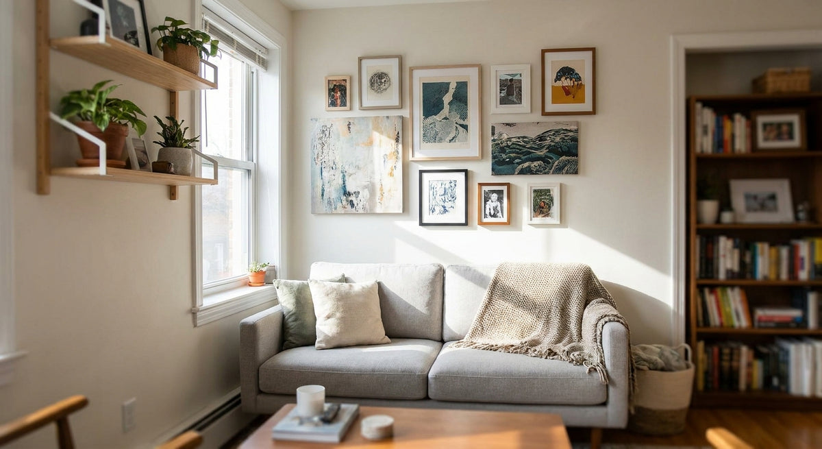
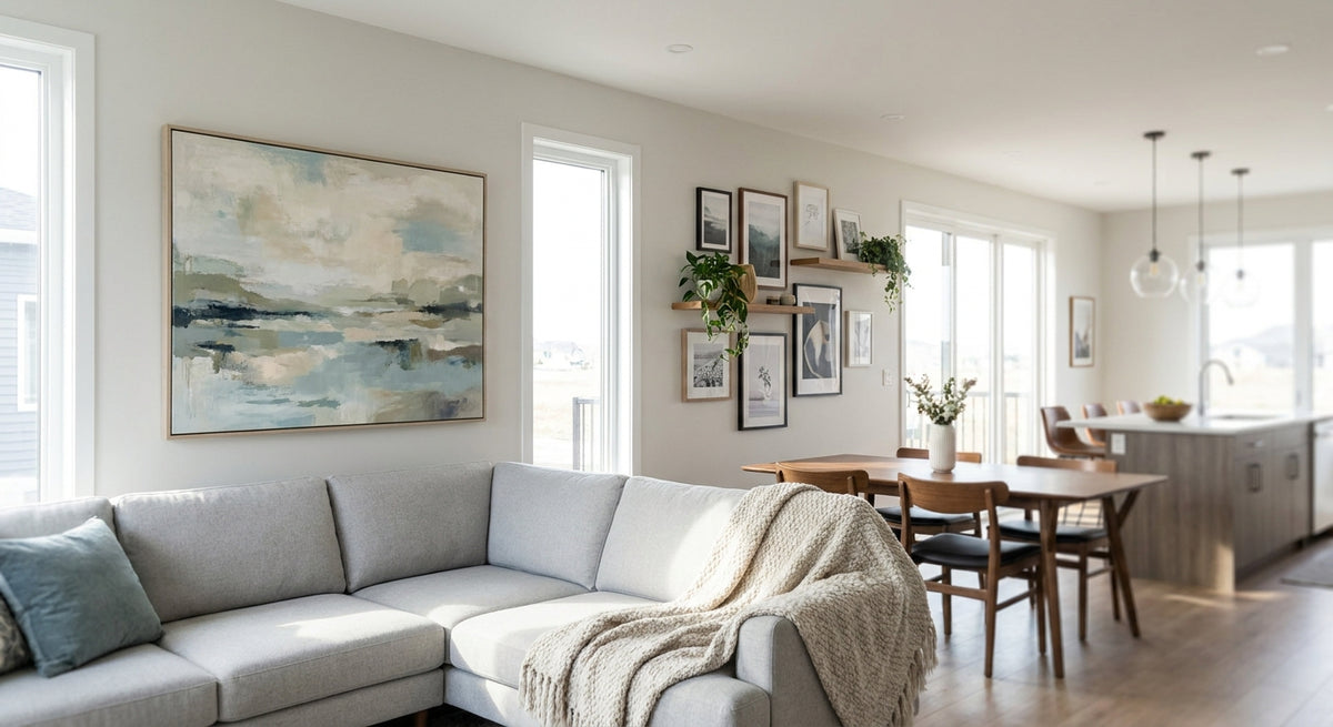
An accent wall print needs to relate to the wall it's on, not the square footage of the room. A single piece or tight cluster should span 60-75% of the wall's width — go smaller and the art reads as decoration instead of a focal point, especially on walls wider than 8 feet.
Contrast with the accent finish
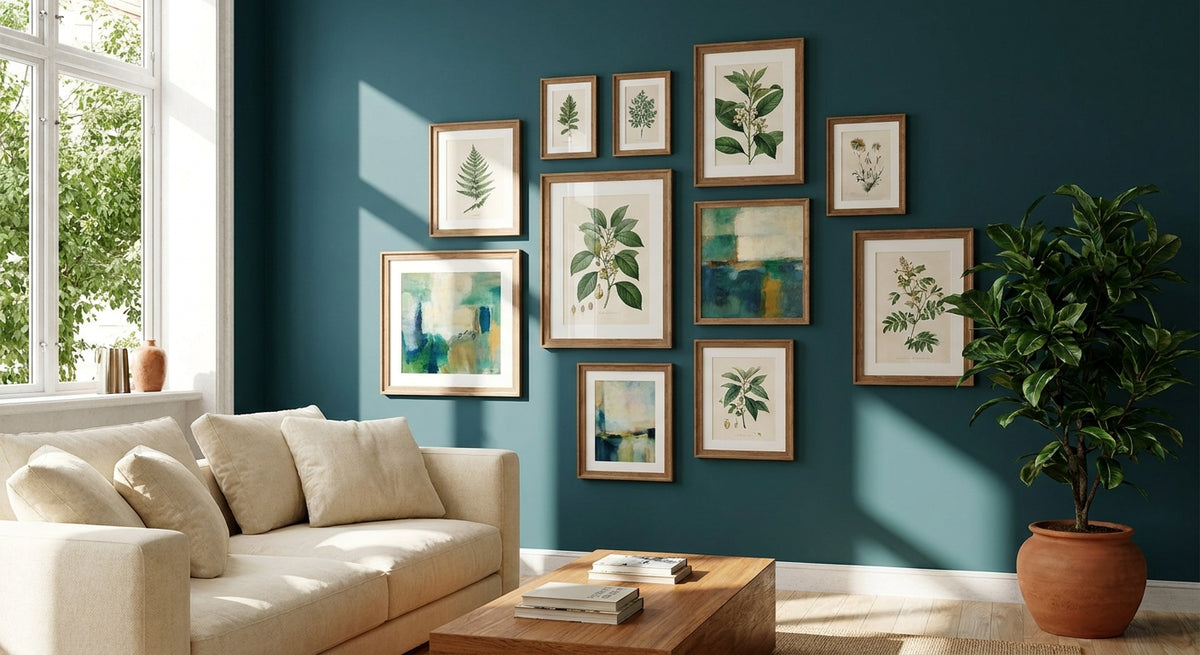
If the wall itself is already busy — a bold paint color, wallpaper, or textured shiplap — the art needs a quieter palette to avoid visual noise. A deep navy or terracotta accent wall calls for art with muted tones and simple composition, not another loud pattern layered on top.
Subject matter that fits the room's function
A dining room accent wall can carry a still life or a lush botanical without a second thought. A home office accent wall does better with abstract or landscape work — anything too narrative competes with focus. Match the subject to what the room is actually for in 2026, not just what's trending.
Framed vs. canvas for texture play
On a textured accent wall — brick, shiplap, grasscloth — a framed print adds a clean edge that separates the art from the wall's texture. On a smooth painted accent wall, an unframed canvas print blends into the surface in a way that feels more built-in, less "hung."
Single statement vs. a set of two or three
A single large piece anchors a wall with less visual clutter, which suits minimalist or Japandi rooms. A set of two or three lets you build a rhythm across a wider wall — useful in Coastal Luxe or eclectic spaces where a bit of layering reads as curated rather than sparse.
Top picks for accent walls
Secret Villa — the safe pick. Warm Mediterranean tones and a sense of place make this one work on almost any neutral or greige accent wall. Size it at 36 inches or wider so it reads as a focal point rather than filler; smaller and it gets lost against a painted feature wall. It pairs naturally with Coastal Luxe and warm Japandi rooms alike. Buy.
Vanishing Desert — the wildcard. This piece is exclusive to Gioia Wall Art, which means you won't see it duplicated on a neighbor's accent wall. Its muted desert palette holds up against a bold terracotta or rust-toned wall where most prints would wash out. Go big here — at least 40 inches on the long edge — since desert landscapes lose their sense of scale when small. Buy.
Still Together — the quiet statement. This one works as a single anchor piece on a smooth, softly colored accent wall where you want calm rather than drama. It's the pick for a bedroom or reading nook accent wall, not a high-traffic entryway. Hang it at 57-60 inches to center, standard eye level for a seated or standing view. Consider.
Between The Lilies — the soft floral option. For a pastel or Cottagecore-leaning accent wall, a botanical piece like this fills the brief without overpowering the room. It reads best in a smaller nursery or reading corner rather than a large open-plan wall, where it would need to be paired with a second piece to hit that 60-75% width rule. Consider.
Also worth noting: Secret Villa is the one to start with if you're unsure which direction your accent wall is heading — it's the most flexible of the four across styles.


What to avoid on an accent wall
- Prints under 16x20 inches on a wide wall. They read as an afterthought once the wall is more than 8 feet across — you end up needing three or four to fill the space, which defeats the point of a single statement wall.
- Busy patterns on already-textured walls. Shiplap, brick, and heavy wallpaper are visual patterns in their own right. Layering a busy print on top competes rather than complements.
- Art meant for above furniture, hung as a solo accent piece. A print sized and composed to sit above a sofa or bed doesn't always scale up to carry a full wall on its own — if that's your actual goal, wall art for above the sofa is the better starting point than a standalone accent wall guide.
An accent wall needs one anchor piece, not four small ones fighting for the same six feet of wall.
Verdict comparison
| Pick | Best for | Visual weight | Verdict |
|---|---|---|---|
| Secret Villa | Neutral or greige accent walls | Medium-warm | Buy |
| Vanishing Desert | Terracotta or rust-toned walls | Bold | Buy |
| Still Together | Bedrooms, reading nooks | Quiet | Consider |
| Between The Lilies | Pastel, nursery, Cottagecore rooms | Soft | Consider |
FAQ
What's the best accent wall art for a small room?
A single medium piece, roughly 24-30 inches wide, works best in a small room — it covers the 60-75% width rule on a narrower wall without overwhelming the space. Avoid multi-piece sets in rooms under 100 square feet.
Is one large print better than a gallery wall for an accent wall?
A single large print reads cleaner on an accent wall because it doesn't compete with the wall's own color or texture. A gallery wall works better on a plain white wall, not the feature wall itself.
How high should accent wall art be hung?
Center the piece 57-60 inches from the floor, which is standard eye level for most adults. In a room with high ceilings, you can shift slightly higher to balance the vertical space.
Should accent wall art match the wall color exactly?
No — art that matches the wall too closely disappears. Aim for tonal contrast: a warm terracotta wall pairs better with muted, cooler-toned art than with more terracotta.
Can framed prints work on a textured accent wall?
Yes, framed prints work well on textured walls like shiplap or brick because the frame edge separates the art from the texture behind it, keeping the piece from blending in.
How much wall coverage does accent wall art need?
Cover 60-75% of the wall's width with a single piece or tight cluster. Anything smaller looks like it was placed there temporarily rather than chosen for the wall.
What size wall art works for a wide accent wall over 8 feet?
On walls wider than 8 feet, go with a piece at least 36-40 inches on the long edge, or use a set of two to three prints spaced evenly to hit the 60-75% coverage target.
One last thing
The most common accent wall mistake in 2026 isn't color or subject matter — it's hanging art sized for a gallery wall on a wall that needed one statement piece instead. If you're staring at a blank accent wall and can't decide, go one size larger than feels comfortable; undersized art is the mistake people notice, oversized almost never is.