Fine Art Prints for Mood Boards: 2026 Buying Guide
A mood board only works when the art on it can survive the jump from screen to wall, and that's where most interior boards fall apart. This guide breaks down what makes fine art prints board-worthy versus phone-only pretty, with picks pulled from the Gioia Wall Art (https://gioiawallart.com/) catalog of over 6,000 curated pieces.
- Under The Fig Tree anchors a Mediterranean or Coastal Luxe board with warm, still-life tones — Buy for boards needing a focal point.
- Neutral Transitional Abstract Style A is the safest fine art print for a board that has to please a client fast — Buy.
- Magical French Garden works as the maximalist statement piece on romantic or Cottagecore boards, but it's a Consider, not a default.
- Fine art prints with visible brushwork or grain photograph poorly on boards lit for real-estate listings — swap for flatter finishes.
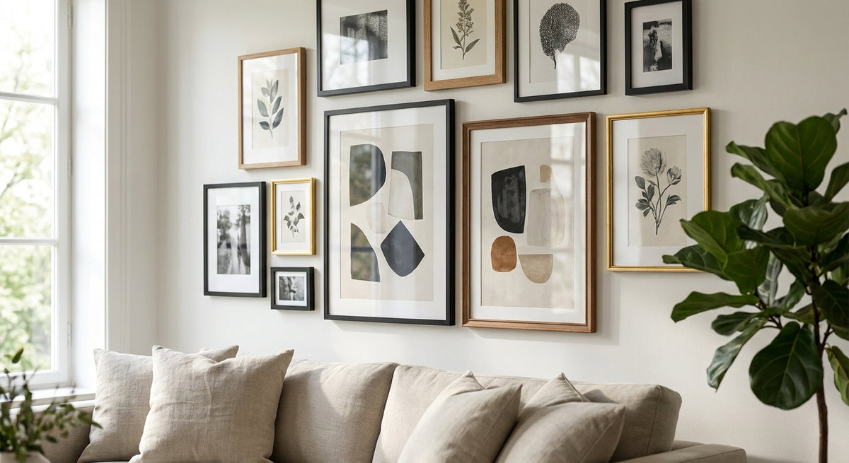
- 2026 mood boards lean toward mixed scale: one large anchor print, two mid-size supports, one small accent.
Why this matters
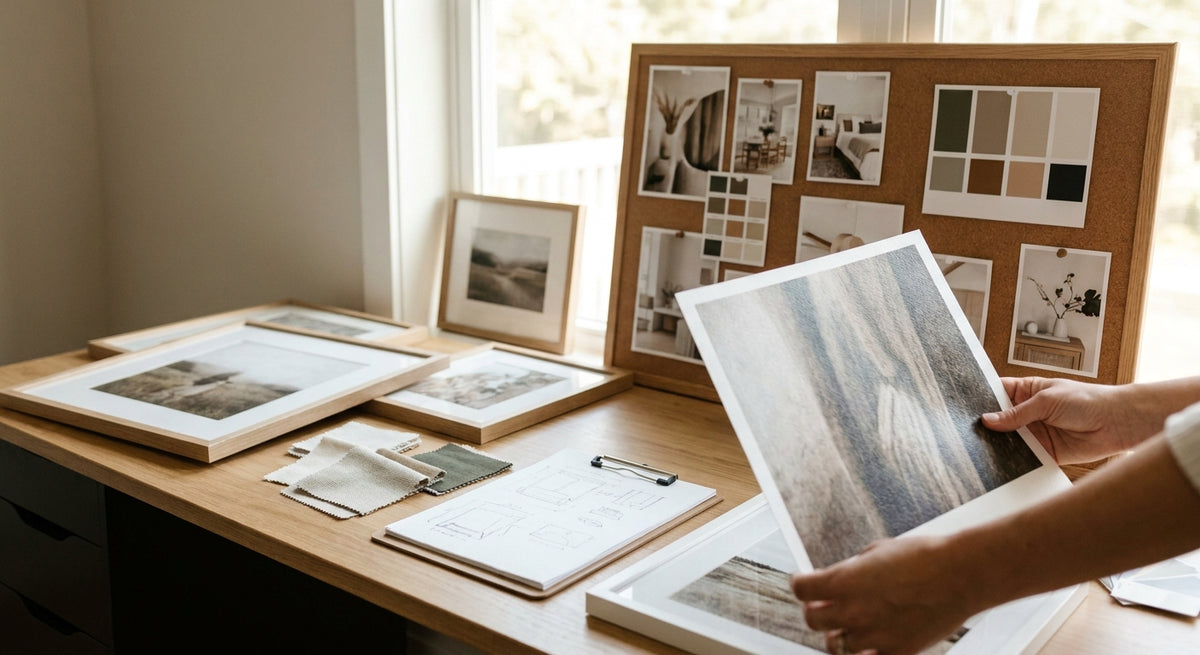
A mood board is a sales tool before it's a design tool. Clients, landlords, or your own Pinterest audience are judging the whole room off a handful of images, and a fine art print that reads as flat or muddy on a board kills the pitch before the furniture even gets picked. In 2026, with more design decisions happening entirely through shared digital boards instead of in-person swatch meetings, the print itself has to do double duty: look right in a 400-pixel thumbnail and hold up once it's actually hung.
Who this is for
This is written for interior designers building client presentation boards, home stagers pulling together a look fast, and serious decor shoppers who curate Pinterest or Canva boards before they buy anything. If you're choosing one print for one wall, skip this — this is for people assembling three, five, or eight pieces that need to read as a set.
What to look for in fine art prints for mood boards
A cohesive color story, not matching colors
Mood boards fail when every print is the exact same shade — it reads flat instead of curated. Look for fine art prints that share an undertone (warm ochre, cool sage, dusty blush) rather than an identical hex code, so the board has depth when it's presented in 2026's mixed lighting conditions, from client laptops to in-person swatch walls.
Texture and finish contrast
A board with four glossy canvases feels stiff. Pull in at least one matte fine art print or paper-finish poster to break up the reflectivity, especially if the board will be photographed under overhead lighting.
Scale variety built into the composition
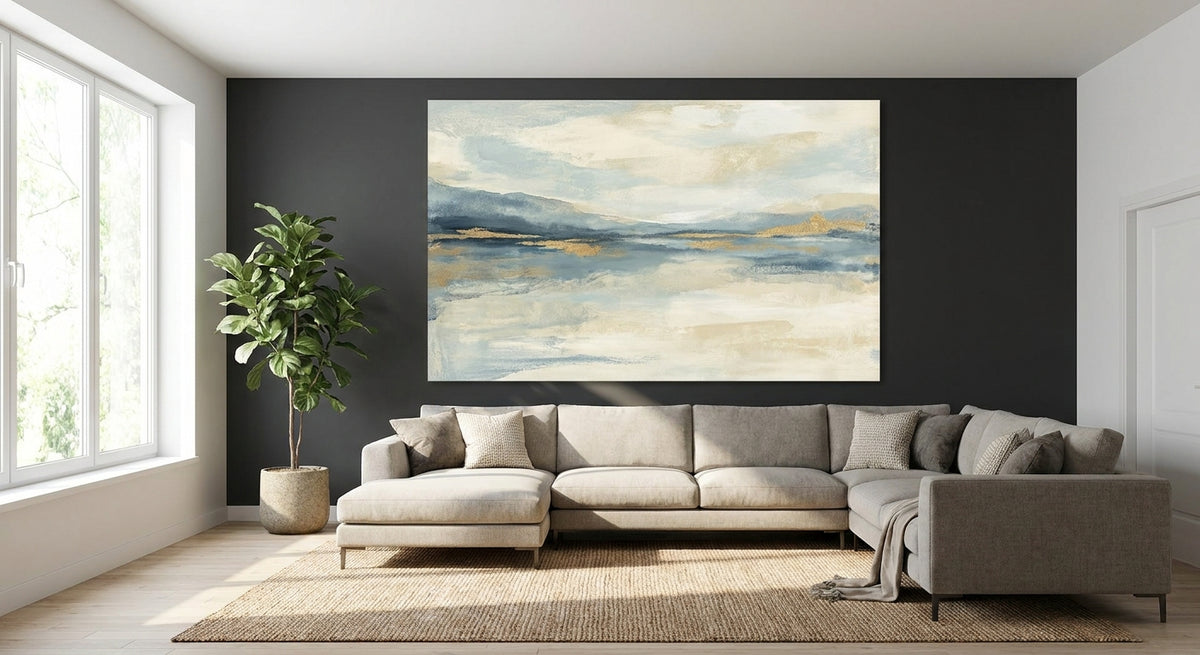
Every print at the same size makes a board look like a spreadsheet. Pair one large focal fine art print with two mid-size supports and a small accent — the same 60/30/10 weighting designers use for color works for scale too.
A narrative or cultural through-line
Random pretty images don't hold a board together; a shared reference does. Mediterranean still lifes, Provençal gardens, or Americana portraiture each give a board a story a client can repeat back to their friends.
Print quality that survives a close crop
Clients zoom in. A fine art print reproduced at low resolution turns soft and pixelated the second someone pinches to zoom on their phone, which undercuts the whole presentation regardless of how good the composition is.
Top picks for mood boards in 2026
Under The Fig Tree — the anchor piece. This still-life fine art print carries warm Mediterranean tones that read well against both linen-neutral and terracotta palettes, making it a strong focal point for Coastal Luxe or Old World-inspired boards. It works at large scale without losing detail, which is exactly what an anchor print needs to do. Buy for any board built around a warm, food-and-garden narrative.
Neutral Transitional Abstract Style A — the safe pick. This is the print you reach for when a client can't articulate a style yet. It's abstract enough to avoid clashing with existing furniture photos, and neutral enough to slot into a Japandi, Modern Farmhouse, or Transitional board without a second thought. Buy — it's the one pick on this list that works on almost every board you'll build in 2026.
Magical French Garden — the wildcard. Dense, romantic, and busier than the other picks, this fine art print is a strong choice for a Cottagecore or maximalist board but a wrong note on anything minimal. It's the piece that makes a board memorable, not the piece that makes it safe. Consider — use it as your one loud element, never as the anchor and the accent both.
Soft Blush Serenade — the softener. Named for a reason: this print pulls a board's palette toward blush and warm neutral without tipping into pastel-nursery territory, which makes it useful on boards that need to feel gentle without feeling young. Consider for Coastal Luxe or soft Transitional boards; skip it if the board already leans warm-toned, since two soft pinks will flatten the contrast.


What to avoid on a mood board
- Heavily textured canvas at small scale. A tiny 8x10 print with visible weave detail turns to noise on a board photo — save texture-forward pieces for the anchor slot.
- Two competing focal points. One loud print (like Magical French Garden) plus a second equally busy piece and the board loses its hierarchy; a client won't know where to look first.
- Fine art prints with heavy warm cast next to true-white walls in the reference photo. The mismatch reads as a color error even when the print itself is correct — swap the wall photo or the print, not both.
Verdict comparison
| Pick | Best role on the board | Palette | Verdict |
|---|---|---|---|
| Under The Fig Tree | Anchor / focal | Warm Mediterranean | Buy |
| Neutral Transitional Abstract Style A | Universal support | Neutral, warm-grey | Buy |
| Magical French Garden | Statement / wildcard | Dense floral, saturated | Consider |
| Soft Blush Serenade | Softener / accent | Blush, warm neutral | Consider |
FAQ
What are the best fine art prints for an interior design mood board?
The best fine art prints for a mood board share an undertone rather than an exact color match and vary in scale — one large anchor, two mid-size supports, one small accent. Under The Fig Tree and Neutral Transitional Abstract Style A both work as reliable anchors in 2026 boards.
How many fine art prints should go on one mood board?
Most working boards use four to six pieces: one anchor, two or three supporting prints, and one small accent. Fewer than four tends to look sparse; more than eight starts to compete with itself.
Should mood board art match the wall color in the reference photo?
No — it should complement, not match. A fine art print that exactly matches the reference wall color reads as flat; look for a shared undertone with contrast in value instead.
Is a canvas print or a framed print better for a mood board photo?
Canvas reads better on boards viewed digitally since it avoids the glare a framed glass piece can throw under studio lighting. Framed prints show their real advantage once the room is actually installed, not on the board itself.
Can abstract fine art prints work on a traditional or farmhouse mood board?
Yes, in small doses. A single neutral-toned abstract print softens a farmhouse board without breaking the theme, as long as the palette stays warm and muted rather than stark or graphic.
How do I keep a mood board from looking cluttered with too many art styles?
Limit the board to one dominant narrative — a season, a location, or a mood — and let every print reference it, even loosely. A board with five unrelated styles reads as indecisive, not curated.
What size fine art print works best as a mood board anchor?
The anchor print should be the largest single element on the board, roughly double the visual weight of any supporting piece, so the eye has one clear starting point before it moves to the rest.
One last thing
The print that photographs best on a screen is not always the print that reads best on the wall — matte, softly-toned pieces like Soft Blush Serenade tend to lose some presence in a bright thumbnail but gain it back once hung under real room lighting, so don't cut a print from the board just because it looks quiet on a laptop.